Tech Co. Head Office
This new 12,000 s.f. head office for a Toronto-based tech company is located in a downtown office tower. Although the design was restricted by pre-existing base building standards, such as a dropped T-bar grid ceiling, a space plan was adapted to accommodate up to 100 employees in a fun and energetic work environment. The existing area was substantially demolished to provide larger open plan workspaces, multiple meeting rooms, a lounge and a large kitchen-lunch room. We were able to reduce the waste by re-using most of the pre-existing wood doors, frames and side lights.
In the Reception area, the bright graphic graffiti wall wrap, plus wall art and sofa, announces the bold character of this tech start-up company. Instead of a traditional corporate logo and name above the reception desk, an image of the product became a vivid and impactful custom wall graphic.
To add visual interest, the corporate logo was configured into a pattern for the safety strip on glass doors and offering privacy to office door side lights.
The finished environment reflects the biophilic design principal of bringing in elements of the natural world into a built environment to improve human health, productivity and general well-being.
Large plants and wall images of nature and natural materials abound, along with a reoccurring circular motif. These organic elements counter-balance the linear forms of wall partitions, ceiling grid and angular furniture.
Much of the company’s contemporary furniture in a neutral grey colour was re-purposed in the new space. In the lounge area, colourful round ottomans and accent cushions were introduced to add life and a sense of fun to an otherwise neutral environment of off-white walls, carpet and furniture.
Drawing on the psychological impact of colour, accent walls throughout the work spaces are painted a vibrant red-orange encouraging energy and innovation, bright green for growth and renewal, and a cheerful refreshing sky blue.
The space plan placed high priority on maximizing the number of workspaces with views to outside. Glazed wall panels and internal doors allow natural light to flow into internal corridors and rooms. New LED ceiling grid fixtures were installed to mimic natural light with energy saving on/off sensors to detect movement.
In addition to the bold wall wraps designed for the reception area, a custom designed vinyl wrap featuring the company’s product adorns a large wall space. A couple of thoughtful quotes were chosen for accent walls in frequently travelled corridors. And to keep things fresh, periodically the lettering can easily be removed and replaced with other quotes.
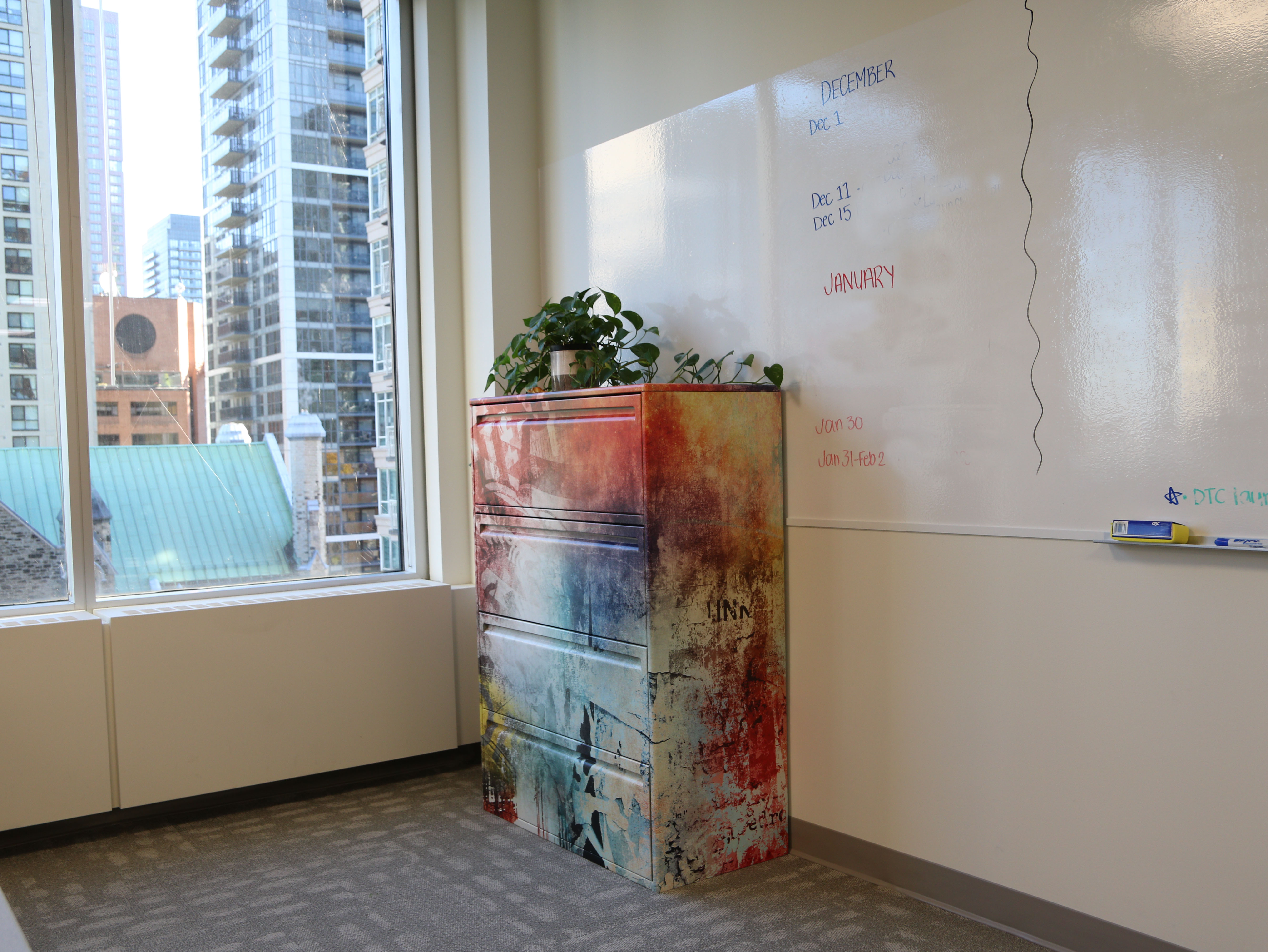
File and storage cabinets positioned in open works spaces were vinyl wrapped in a colourful graffiti-style design. Large expanses of adhesive write board were incorporated throughout the open and closed work spaces and meeting rooms, complete with custom-made borders and eraser holders.

© 2018 Andrea Scott-Pearse
Interior Design + Project Management
Site by kesvn studio
